![[Metroactive Features]](/features/gifs/feat468.gif)
[ Features Index | San Jose | Metroactive Central | Archives ]
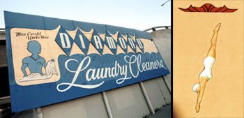
Faceless Ladies: Miss Careful has graced the Diamond Laundry sign since 1950. Painter Norman Hollingsworth, doing a touch-up of the sign in 1997, died before her face could be filled in.
The diving lady of the Hotel De Anza was added in 1951 and originally was diving toward a sign which read, "Heated Pool."
Strokes Of Genius
Long before graffiti, brick buildings were a palette for sign painters. Today, they're an endangered species.
By Genevieve Roja
CRAFTSMANSHIP SEEMS TO DIE with the dawning of new technology. Who, in this day and age, has the time or the patience to make hand-carved furniture, handmade quilts, a house from scratch, or hand-paint a sign copied from a photograph? The answer to the latter is a scant, exclusive brotherhood that includes local sign-painters like the deceased Norman Hollingsworth and the still-thriving Rey Giese, 81. Giese fell into the business painting for Shell Oil. One day, while Giese was painting a saloon on the side of a building, a man hollered his way.
"Hey, how would you like to learn how to paint signs?" he yelled, recalls Giese. "We leave Monday morning and come back Friday."
Back in San Jose, he met Hollingsworth and began painting locally, on First, St. James and Santa Clara streets. Giese alone can claim to have painted almost all of downtown San Jose red.
"I can raise my hand to God that I painted all the gold leaf signs of the stores [downtown]," he says. "Of course, there are only about three to four people that can verify it today, but they'd be 90 years old."
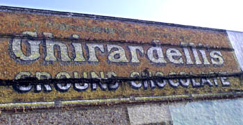
The handiwork of men like Giese, Hollingsworth and many others who plied their trade in the '40s, '50s and '60s is rapidly disappearing. Most hand-painted signs--usually advertisements painted on the sides of buildings--have been painted over, sandblasted or demolished. Today, only remnants of these signs exist, such as the Ghirardelli Chocolate sign on the right-hand side of Agenda restaurant, from the South First Street perspective; or those marking San Jose's fruit-packing past, such as Del Monte and Libby's in Japantown.
And because of their rarity and the era they represent, hand-painted signs have become chic again. The Peninsula Creamery in Palo Alto, for instance, looks classic with its hand-painted sign, but in fact, it's not a piece of history. According to Dennis Backlund, historic preservation specialist for the city of Palo Alto, the store has an old facade, but the sign over the front door was simply made to look old. Installed within the last year, the sign was custom-built--still hand-painted, but copied to look like the motifs of the '50s.
The Santa Clara Valley still has a small stock of hand-painted wonders, some captured inside of buildings, others lovingly preserved on restaurant walls. Here are some of the most impressive saves.
Signs of the Times: The great disappearing signs have captured preservationists' attention.
Diamond Laundry and Cleaners
The sign is comforting. Patrons leave dirty laundry--some items possibly stained for good--in the hands of Miss Careful, hoping she will spin her magic and remove that blasted ink stain from that favorite pair of pants. Since 1931, Miss Careful has been a Diamond logo, appearing on its laundry bags, Yellow Page advertisements and company rubber stamps. She looks like Archie's Betty, hair pulled back at the crown, Colgate smile, bow in her hair, hands clasped as if ready to rub them and say, "Miss Careful is ready to work!" Outside the building on San Carlos is the famed hand-painted sign that indicated that, yes, "Miss Careful Works Here." Underneath the words is a faceless woman in a maid's uniform, folding laundry. On her left, our right, are white letters spelling out the words "Diamond." Each letter is framed within a four-pointed, baby-blue-colored diamond. Underneath that, in neat cursive, is "Laundry Cleaners."
The sign was installed in 1950, after the store had relocated from its previous site on Grant Street, where the business was known as Diamond French Laundry. The name was derived from former owner Harold H. Hulbert's diamond birthstone, and "French" came from Hulbert's sister and brother-in-law, the La Lannes, who were French. Hulbert passed away Sept. 25, 1997, and now his wife, Mary, and stepson, Gary Burton, help run the business. A month following Hulbert's death, the painter of the outdoor sign, Norman Hollingsworth, passed before he could finish painting the face on Miss Careful. Mary recalls that Hollingsworth's hand was "heavy" at the time, and that despite his old age, Hollingsworth would haul his ladder to complete his assignment.
"He was on his ladder and he was shaky," recalls Mary. "I told him this was a sign from Harold to get down."
Evidence of Norman's heavy hand is in Miss Careful's left forearm, which Mary points out is nearly twice as large as her right forearm. The bottom of the sign, underneath the cursive letters, is also a different color than the fading royal blue paint. Mary says the city has painted over the area, a hot spot for graffiti vandals. Oddly enough, vandals have never defaced Miss Careful. Mary receives all kinds of offers by art students to paint Miss Careful's face, but Mary is content leaving her alone for now.
Then, during our conversation, Gary produces a long piece of yellowed butcher paper with charcoal rubbings on one side and a perforated outline of ... Miss Careful. We've just stumbled upon Norman's Miss Careful template.
"I'm a pack rat," Gary says. "I don't throw away anything."
Hotel De Anza
After a prolonged sign dispute that nearly threatened the diving lady of De Anza from being permanently blasted from memory, city officials decided to let her stay. It is important to note that the diving lady did not exist when the De Anza was originally built in 1931; she was added in 1951.
Today, those unfamiliar with her past might be confused with the current image, a plunging diver headed for nowhere, diving underneath some kind of cloud, a crested motif. The motif, however, is part of the original sign, which featured the crest at the top to look like waves. Beneath the waves was the diver, who weighed less than today's robust diver and carried a hybrid frame of Barbie and Esther Williams. In 1951, she wore a white bathing cap and bathing suit as she headed into another body of water with the words, in block letters, "Heated Pool," a nod to the hotel's then existing heated pool. Written underneath those words, dead center and in cursive, were the words "Jack Horner's."
The rooftop neon sign carries as much notoriety as its famed diver. The neon in the signs wasn't installed until 1931, and prior to the hotel's construction, the powers-that-be had decided that the hotel be named San Jose Hotel.
Chocolat: This sign on the side of Agenda was an early advertisement for Ghirardelli's chocolate. A man named Julius Wesnitzer once owned the building.
Ghirardelli Chocolate At Agenda
The house that Julius Wesnitzer built in 1908 had been a tire store, a drugstore, a bar and a punk rock club long before Jacek Rosicki remade it into a restaurant, bar and jazz lounge in 1995. Following the 1906 earthquake, Wesnitzer had moved from a spot at First and San Carlos to the current site, the building now known as Agenda. Wesnitzer's family lived in the apartments upstairs, sharing the downstairs space with Fair McQuoid Co., a tire outfit. At one time, the Wesnitzer family ran their own plumbing supply store from downstairs, as evidenced by the hand-painted sign on the right-side wall of the building: "Julius Wesnitzer. San Jose Plumbing and Sheet-Metal Works. AUTOMOBILE LAMPS, HOODS, RADIATORS AND FENDERS MADE AND REPAIRED." Former downstairs occupants included the Moorhead Flemming Drug Company in 1920, Garrucio Drugs in 1950 and blue-collar bar The Three Star Tavern in 1957. In 1982, the downstairs became Marsugi's, a live punk rock club where Nirvana once played.
Although late-night revelers wouldn't know it or spot it, there's a hand-painted Ghirardelli Chocolate sign on the right-hand side of the building as you face South First Street. It reads, "Ghirardelli's Ground Chocolate since 1852." Above that sign, in faded letters, is a tag line that reads "... wage for every age." Neither Rosicki nor Wesnitzer's granddaughter, Roberta Christenson, knew who painted the Ghirardelli or Wesnitzer signs, or how long they have been on the side of the building. Christenson says she never knew her grandfather, who died before she was born. Both Rosicki and Christenson can validate that the building was most likely a Ghirardelli Chocolate advertisement and not a sign indicating that the building was a chocolate factory.
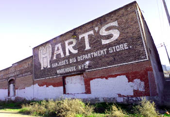
Have a Hart: Before Valley Fair, there was downtown's Hart's, a premiere shopping destination. The building shown here was one of several warehouses used to store Hart's merchandise.
Hart's
Visible from the north side of the Coleman Avenue overpass (at Julian) is an old hand-painted sign for what was once a warehouse that received Levi's and other goods for San Jose's largest department store, Hart's. Off of San Pedro, on Bassett Street, the Hart's sign is at the end of the cul-de-sac, on the last brick building on the right. In big, white block letters the sign legibly reads "Hart's," with the letter "H" engulfed by a heart, once part of the store's logo. Underneath that, "San Jose's Big Department Store." Beneath that, "Warehouse No. 2." And even more telling than any of these words assembled, the word "Jung," painted in the right-hand corner of the sign. I imagine it's the sign of the hand-painter, though neither Alex Hart Jr., grandson of Hart's founder, Leopold, nor the building's past owner, Charles Hackett, could verify that fact.
To the left of the Hart's sign is another aging hand-painted sign, in faded lettering: "Uter Company Hardware. Plumbing Supplies. Tinning Supplies." There is no signature with the sign.
Interesting to note is the proximity of the warehouses to the Caltrain tracks, about a couple of feet away. The warehouse's prime location makes it a perfect drop-off destination for trains passing through.
Leopold Hart opened the downtown store in 1866, becoming the city's premier shopping destination for decades. Alex Hart Jr. believes the warehouse dates back from the early 1920s. At the time, the Harts owned three adjacent buildings, including the one with the outdoor logo, that served as warehouses. The idea for the insignia, he says, is obvious.
In the middle 1970s, the Harts moved to Sunnyvale and Mayfield Mall in Mountain View from their downtown location on Market and Santa Clara streets, since downtown had become blighted and "so bad," as Alex puts it. The Harts then sold the warehouse to Charles and Charles, an antique business whose owner, Hackett, also sold the warehouse in 1983, after a 15-year residency.
There is a tone of lament in Alex's voice when he talks about relocating the Hart's stores, especially the San Jose flagship, which once held the reputation as one of the largest department stores between San Francisco and Los Angeles.
"It was a major retail outlet downtown and we were very popular there," says Alex, 80. "We were like a Macy's, except we were in downtown San Jose. Downtown was the retail center of the entire valley. It was like Valley Fair downtown, with Hart's and Hale's [another department store]."
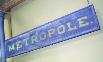
Heartbreak Hotel: Once one of the most recognizable signs in San Jose, the Metropole sign now hangs in the office of Garden City Construction.
Hotel Metropole
I was convinced that the Hotel Metropole sign was broken into pieces, wrenching in pools of crumbly brick and rubble near the foundation of the newly gutted building that will house BayArea.com, corporate site of the Knight Ridder-owned Merc and Contra Costa Times. But on a lucky day, I stopped by the trailer of Turner Construction and asked Richard Babcock, the project superintendent for the Metropole, where I could find the sign. At first he didn't know what I was talking about, exchanging shrugs with another Turner fellow who looked just as confused. "Oh wait, could it be this one?" says Babcock. And sure enough, there is the sign in a photograph, spelling out the word "Metropole" in big, black block letters. "One of the architects took this." But where, where was it? Was it demolished, sold, donated? "Dunno," says Babcock. "It might be at the dump," chirps the Turner fellow. "Yeah, could be there," says Babcock. I return to my car in defeat. Another sign casualty. Then I hear Babcock chasing after me, asking if I have time to tour the interior of the Metropole. Sure, why not? Maybe I'd find the sign with the rest of the rotting wood that hung on since the Metropole opened in 1902 and survived the 1906 earthquake. Then he decides to make a few phone calls, and presto, a break. "James Salata. He was the original contractor before us. Garden City Construction. I believe it's hanging on a wall." I race over to South First Street, peek toward the back wall, and bingo, there's the sign, hanging comfortably in its new home.
Salata later tells me that he asked for the Metropole sign from the building's owners. When asked about their identities, Salata said that he "didn't want to talk about it." Asked if he paid for the sign, he answered no, he didn't pay for things if he could help it. At the end of our conversation I discover that Salata--a preservationist buff who owns a porcelain Coca-Cola sign, a fin sign that used to hang at the Hong Kong Market, and antique light fixtures, among countless other things--owns not one, but two Metropole signs. The first is the sign with capital letters painted with some kind of granule, done in a schmaltzy style. The second is another Metropole sign made out of porcelain. Salata also adds that the Metropole is named after a famous European hotel and that it became common practice to name U.S. hotels "Metropole," after their swanky Euro counterpart.
"Someday I'll donate it to a historic museum," says Salata, referring to the Metropole sign and his other antiques. "And [in the meantime], if someone wants to check it out, they can."
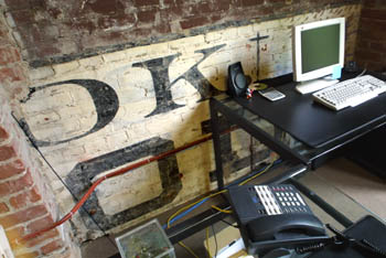
Guppy Books
The sign gods must've been crazy. I had discovered Metropole, and now I was off again, looking for another hand-painted sign in the building that Ray Giese gold-leafed. A girl pages Bella Mia owner Bill Carlson, and 10 minutes later Carlson comes down from his office holding two pieces of paper: one is an old photograph of 52 and 58 S. First, and the other is an artist's rendering of the two stores, a pharmacy and E. Guppy's Bookstore. "I know what you're talking about. I let the guys on the third floor know we're coming." Design Reactor is a web-design firm brimming with twentysomething, V-neck sweater and jeans guys and gals in a cubicle-free environment, which actually complements the brick walls. I explain my reason for the visit and instantly feed my sign appetite. At the back of the room, close to the two glass windows, is the hand-painted, slightly faded sign. In the fade of the brick wall, I can make out three lines of white letters: "GUPPY. BOOKS. STATIONER." Underneath the stacked three words, I observe that this portion has been painted over at least once. Against a white background, black block letters stand out: "OOK." And beneath it, "OODS." Carlson tells me later that the side of the building with the sign was constructed in 1870. The adjacent building, the one housing Design Reactor, was built in 1872, says Carlson. "Man, we were trying to figure out what this meant," says Jeff Dumo, director of new business. "That's pretty cool."
Faber's Cyclery
Faber's is one of those places where only the locals know its exact locale, as if you'd have to ask the Caravan where the Cinebar was if it wasn't in the phone book. Only two blocks south of the Metro office, Faber's, in a dilapidated house built in the 1870s, is an obscure fix-it shop that opened business in 1921. Painted on the other side of the store, in a faded barnyard red, is a virtual advertisement for Schwinn, completed in the '60s. "Schwinn Built Bicycles," it says on the lower half of the sign. Encompassing most of the sign is a circle with an American Red Cross insignia. In the insignia, "Schwinn" is spelled both vertically and horizontally. Encircling it is another circle, which reads "Quality," written at the top, and "Chicago," written at the bottom. On the left-hand side of the circle is a painted Schwinn 10-speed and a low rider with banana handlebars. Above the entire advertisement is the original "Faber's Cyclery" sign that dates back to the 1930s. The letters are painted in white against a faded, forest green background. Around the corner, on the South First side, is a large wooden door with a noticeable gap under its left side and a sign at the top of the door: "Bicycle Accident Investigator," I read, "Alexander LaRiviere." Then, as I round the corner again to further examine the Faber's sign, the same LaRiviere is standing next to me, asking if I need anything. The store apparently is going through a major design overhaul, with space being converted into one-part bicycle repair and retail and one-part art workshop. A women's artists group, The Vibrant Palette, will use the space as an art gallery and transform some of the bicycles into artworks. In addition to the two hand-painted signs, there is a third, on the opposite side of the Schwinn ad, with the words "Faber's Bicycles" written in large white letters. While giving me the grand tour of the sales floor and house--imagine any Western movie with wooden wall slats, creaky floors and every element in the house looking crooked and worn down--LaRiviere mentions that the newly remodeled building will be called Faber's Cyclery Museum. LaRiviere assures that none of the signs will be changed, but only repainted to resemble their original selves.
Old Signs: Silicon Valley's Disappearing Legacy
Sign Language: What historic signs say about our lives, and why action is needed to save the valley's scarce reminders of its commercial past.
Plaque Removal: Metro reporter Genevieve Roja takes a neon-lit journey in search of the valley's oldest and most intriguing signs.
Strokes of Genius: An interview with octogenarian sign-painter Rey Giese.
Telltale Signs: Close-up looks at the Courtesy Chevrolet and Orchard Supply Hardware landmark signs.
Pooch Politics: Famed cartoonist takes doggie-head sign to heart.
Living Large: Giant roadside statues are often 'borrowed.'
Signs From the Underbelly: Columnist Eric Carlson offers a photographic tour of some of the most interesting signs in San Jose.
[ San Jose | Metroactive Central | Archives ]
![]()
Photographs by George Sakkestad
![[line]](/gifs/line.gif)
398 W. San Carlos St., San Jose
233 W. Santa Clara St. Downtown San Jose
Photograph by George Sakkestad
399 S. First St., San Jose
Photograph by George Sakkestad
Bassett Street, San Jose
Photograph by George Sakkestad
Corner of Market and Post Streets, Downtown San Jose
Photograph by George Sakkestad
52 S. First St., Downtown San Jose
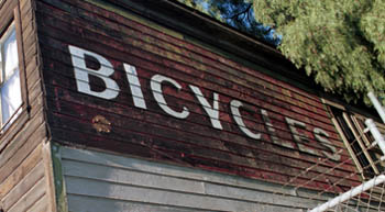
Pop a Wheelie: Since 1921, South Bay residents have come to Faber's Cyclery for bike repair and purchases, like Schwinn beach cruisers and 10-speeds. Owner Alexander LaRiviere will open the refurbished bike shop with an art workshop in spring 2002.
Corner of Market and South First Streets, San Jose
From the April 26-May 2, 2001 issue of Metro, Silicon Valley's Weekly Newspaper.